Bike Rentals Analysis

Excess rentals in TfL bike sharing
We use the TfL data on how many bikes were hired every single day. We can get the latest data by running the following
url <- "https://data.london.gov.uk/download/number-bicycle-hires/ac29363e-e0cb-47cc-a97a-e216d900a6b0/tfl-daily-cycle-hires.xlsx"

# Download TFL data to temporary file
httr::GET(url, write_disk(bike.temp <- tempfile(fileext = ".xlsx")))
## Response [https://airdrive-secure.s3-eu-west-1.amazonaws.com/london/dataset/number-bicycle-hires/2021-08-23T14%3A32%3A29/tfl-daily-cycle-hires.xlsx?X-Amz-Algorithm=AWS4-HMAC-SHA256&X-Amz-Credential=AKIAJJDIMAIVZJDICKHA%2F20210915%2Feu-west-1%2Fs3%2Faws4_request&X-Amz-Date=20210915T203214Z&X-Amz-Expires=300&X-Amz-Signature=71135b4b1c2d17c5385e3c5e98c6d18b7fde088636527408cf35f8dc81f67743&X-Amz-SignedHeaders=host]
## Date: 2021-09-15 20:32
## Status: 200
## Content-Type: application/vnd.openxmlformats-officedocument.spreadsheetml.sheet
## Size: 173 kB
## <ON DISK> C:\Users\LEO~1.LEO\AppData\Local\Temp\RtmpCaYyXv\file3b143ccf29bb.xlsx# Use read_excel to read it as dataframe
bike0 <- read_excel(bike.temp,
sheet = "Data",
range = cell_cols("A:B"))
# change dates to get year, month, and week
bike <- bike0 %>%
clean_names() %>%
rename (bikes_hired = number_of_bicycle_hires) %>%
mutate (year = year(day),
month = lubridate::month(day, label = TRUE),
week = isoweek(day))We calculate an average benchmark for every month using the data from 2016-2019. Then we compare every month from 2016-present to that derived benchmark and color the graph depending on the actual rentals exceed the expected rental (the benchmark) or not.
# Calculate monthly bike change
monthly_expected_rentals <- bike %>%
  filter(year %in% c(2016,2017,2018,2019)) %>%
  group_by(month) %>%
  summarize(expected_rentals=mean(bikes_hired))

# Calculate actual monthly rentals mean
monthly_actual_rentals <- bike %>%
  filter(year %in% c(2016,2017,2018,2019,2020,2021)) %>%
  group_by(year, month) %>%
  summarize(actual_rentals=mean(bikes_hired))

df <- inner_join(monthly_expected_rentals, monthly_actual_rentals) %>%
  mutate(up = case_when((actual_rentals - expected_rentals) > 0
                        ~ actual_rentals - expected_rentals,
                        (actual_rentals - expected_rentals) <= 0
                        ~ 0),
         down = case_when((expected_rentals - actual_rentals) > 0
                        ~ expected_rentals - actual_rentals,
                        (expected_rentals - actual_rentals) <= 0
                        ~ 0))
# Create the graph
ggplot(df, aes(month, expected_rentals, group=1)) +
  geom_line(color="blue") +
  geom_line(aes(month, actual_rentals)) +
  facet_wrap(~year) +
  theme(axis.text.x = element_text(size = 5)) +
  ylim(15000, 45000) +

  #Filling of graph
  geom_ribbon(aes(ymin=expected_rentals,ymax=expected_rentals+up),
              fill="#7DCD85",
              alpha=0.4) +
  geom_ribbon(aes(ymin=expected_rentals,
                  ymax=expected_rentals-down),
              fill="#CB454A",
              alpha=0.4) +

  theme_minimal() +

  #Label the graph
  labs(
    title = "Monthly changes in TfL bik rentals",
    subtitle = "Change from monthly average shown in blue
and calculated between 2016-2019",
    caption = "Source: TfL, London Data Store",
    x = "",
    y = "Bike rentals") +
  NULL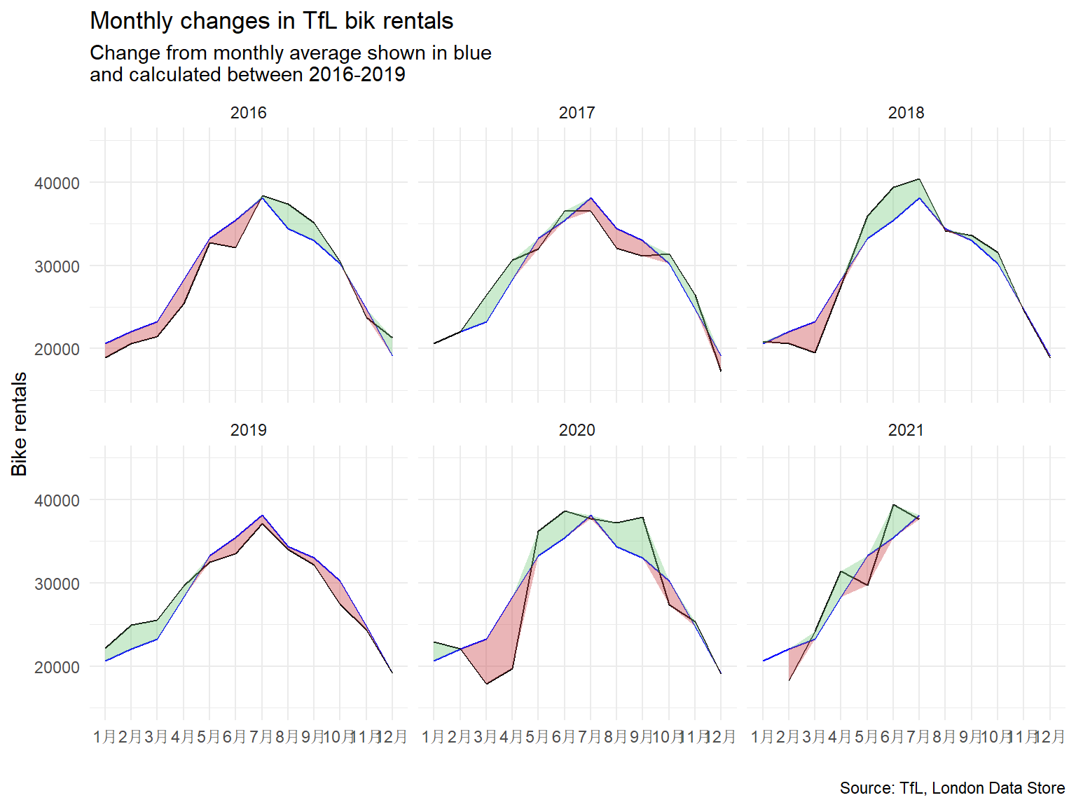
The second one looks at percentage changes from the expected level of weekly rentals. The two grey shaded rectangles correspond to Q2 (weeks 14-26) and Q4 (weeks 40-52).
# Calculate weekly bike change average
weekly_expected_rentals <- bike %>%
  filter(year %in% c(2016,2017,2018,2019)) %>%
  group_by(week) %>%
  summarize(expected_rentals=mean(bikes_hired))

# Calculate actual weekly bike change average
weekly_actual_rentals <- bike %>%
  filter(year %in% c(2016,2017,2018,2019,2020,2021)) %>%
  group_by(year, week) %>%
  summarize(actual_rentals=mean(bikes_hired))

df1 <- inner_join(weekly_expected_rentals, weekly_actual_rentals) %>%
  mutate(change = 100 * (actual_rentals - expected_rentals) / expected_rentals,
         up = case_when(change > 0
                        ~ change,
                        change <= 0
                        ~ 0),
         down = case_when(change > 0
                        ~ 0,
                        change <= 0
                        ~ change),
         type = case_when(down == 0 ~ "up",
                          up == 0 ~ "down"))

# Create the graph
ggplot(df1[1:292,], aes(week, change, group=1)) +

  #Create gray background
  geom_rect(aes(xmin=13,xmax=26),
            ymin=-Inf,ymax=Inf, fill="#E5E7E9", alpha=0.035) +
  geom_rect(aes(xmin=39,xmax=53),
            ymin=-Inf,ymax=Inf, fill="#E5E7E9", alpha=0.035) +
  geom_line() +

  #Create filling between graph
  geom_ribbon(aes(ymin=0,ymax=up),fill="#7DCD85",alpha=0.4) +
  geom_ribbon(aes(ymin=0,ymax=down),fill="#CB454A",alpha=0.4) +

  #Create tickmarks at the side and set their color
  geom_rug(aes(color=type), sides = "b",
           length = unit(0.04, "npc"), show.legend = FALSE) +
  scale_color_manual(values = c("#CB454A", "#7DCD85"))+

  #Facet, change theme and set scale
  facet_wrap(~year) +
  theme_minimal() +
  scale_y_continuous(labels = c("-50%","0%","50%","100%")) +
  scale_x_continuous(breaks = c(13,26,39,53),
                   labels = c("13","26","39","53")) +

  #Label graph
  labs(
    title = "Weekly changes in TfL bike rentals",
    subtitle = "%change from weekly averages
calculated between 2016-2019",
    caption = "Source: TfL, London Data Store",
    x = "week",
    y = "") +
  NULL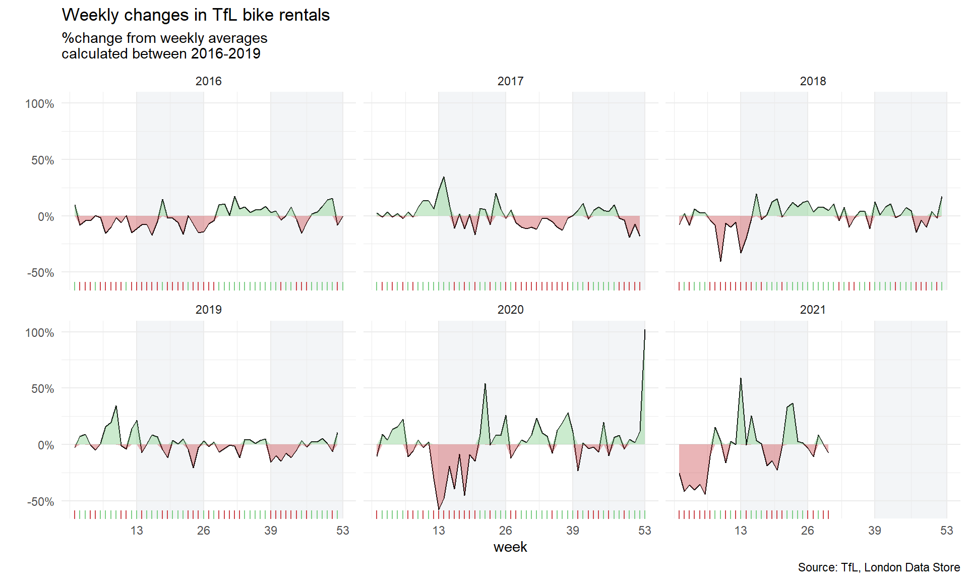
For both of these graphs, we have to calculate the expected number of rentals per week or month between 2016-2019 and then, see how each week/month of 2020-2021 compares to the expected rentals. We use the calculation excess_rentals = actual_rentals - expected_rentals.
We used mean to calculate expected rentals since it incorporates the outliers well without shifting the expectation too much in either direction. Outliers are rare (for example when the tube broke down) but they do have the probability to occur again and hence the mean is a better option in this case to calculate expected rentals.